Wednesday, March 26, 2014

Ju Money: Sang Wook Lee

The Art Center of Troy was exhibiting the work of Sang Wook Lee in its gallery down town. The work that she exhibited was made specially for this gallery and it is easy to see why as you walk into the space. 


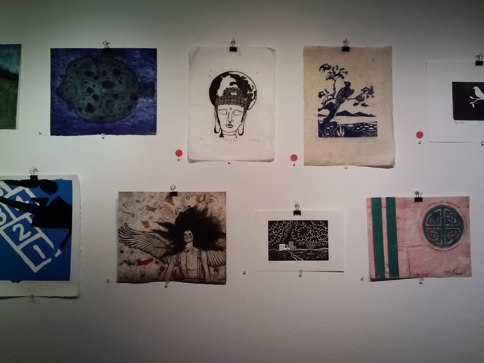
The Art Center also featured student work. It was hard to tell what age groups made each print because of the varying levels of complexity in each one. It seemed that the general message in each piece was about the same though. From the top picture it looks like the student wanted to show a need for unity among the people of Earth. 


These small pouches are called 'bokjumoney' which is a Korean costume associated with 'hanbok'. The pouches used to be carried around by children and were filled with red beans but now they are typically filled with money. They are meant to represent good will in the new year. Alone, these Ramen Noodles are insignificant, but when put together their meaning becomes much greater. 


This instillation is of Ramen Noodles. The purpose of this piece is to magnify the color, texture, and line of an object that is in our everyday lives and we are accustom to seeing. Lee puts this everyday object into a new light by showing many of them and from a new angle. 


The Ju Money piece was definitely my favorite at the exhibit. Even though there weren't a lot of pieces there I enjoyed how large and detailed each one was. It seemed that it took a lot to make this and like the Ramen Noodle piece, alone these pouches don't mean very much but once they are put together their meaning changes. I liked the way that it was hung from thin strings attached to the ceiling and that they all met at the top. I don't think it would have been as successful if they didn't all meet at one place on the ceiling. This point makes each individual piece really feel like one whole sculpture.


These two sculptures also interested me because of their location in the gallery. I found it to be very intriguing that they were placed on these ledges of various heights and that they only become noticeable as one walks up the steps to the next level of the gallery. The lighting from above was successful too and added to their uniqueness because the green walls were turned to different shades depending on where the light hit them. 


I found these two pieces to be particularly interesting because of how both three dimensional, common objects, and painting on the wall were used. Although the objects in this series had little to do with one another, they were brought together by their positioning in the middle of the colorful plaid pattern, and their stark white color. I think another thing that brought most of the objects together was that they were delicate items that seem almost childish and desired but not always had by many people. 


This is a view of the parking lot from the gallery. I thought that it was really nice that the river is visible from the gallery. It is hard to see from this picture but the window actually lets in a lot of light and opens up the space in a great, and much needed way. 

Rosetti Hall Artwork

Rosetti Hall is one of the newest additions to the growing Siena campus. It is easy to tell that it was not build at the same time as some of the others because of its modern look, including solar panels on the outside and more student geared classrooms within. It does keep with the style of the other buildings in that it is brick and has a similar shape however. The main purpose of this new construction is to accommodate for the growing sociology and education programs that Siena offers. Compared to some of the other buildings on campus, Rosetti is filled with artwork. I think that it seems fitting that out of all of the buildings on campus this one is heavy on the artistic end because of the architecture and function of the building. 

This series of ink on paper art was made by Beth Neville and as a whole they are titled 'Studies for Explosions'. For me they were the collection that I enjoyed most out of all of the others in Rosetti. I think that it is great that such a large series was put into the building and that the subject matter that she looked into is unusual and can be looked at in a variety of ways. 

 Many of the language classes are taught in Rosetti. I feel that some of the artwork represents different cultures styles in a way because of the expansive amounts of colors and different styles like that of what you might see when traveling out of the county. While traveling around the three floors of the building I found that there was an incredible amount of variations between the style of each artist.


I was very surprised to notice that there was a sculpture on the second floor. While I thought that the placing of this sculpture didn't really make sense I think that it is great that a sculpture has been included in the collection because normally in a school setting, or place that is not really focused on art, there might just be paintings or artwork that can be hung on the wall. This sculpture has an unknown title but the material that it is made from is metal.


This piece was particularly interesting to me because it is located right outside of a room that I had Spanish class in last semester and something about the subject matter and style reminded me of a South American country. It is a serigraph made by Edward Sokol and the title is 'Fishing Pier'. I really liked the way that some things are outlined in black giving it a cartoon-like look. 


This acrylic and collage piece by Meg Atkinson seemed to me to be something that might be more typically found in a building that doesn't necessarily have artwork but is beginning a collection. The title of this piece is 'Easter Sunday' and it feels like it could have been chosen more for decoration than actual style and composition. 


This piece is a lithograph made by Risaburo Kimura, a japanese artist that was born in the 1920's. The title is 'City 98' and to me having the title is very important to the way we are to perceive this piece. Without it the viewer knows that there is a lot of commotion going on but it is not as easy to tell what kind of an atmosphere the artist wants us to feel like we are in. I think that the contrast in the colors pink and green is very important to the excitement of this piece as well. 


This piece by Sam Gilliam was one of my other favorites in Rosetti. I really loved the size of this piece. It takes up almost the entire back wall on the first floor and because it is in a hall way the viewer is forced to walk from one side to the other to really be able to see the whole thing. I like that the painting forces us to move around and be interactive. The title is 'Scatter' and the medium used to make it was acrylic paint. I also think that it is interesting that the wall it is placed on is a red/orange color. In a typical gallery the walls would probably be white but since it is set in the school, there are a few different colored walls, depending on the floor. 


This last piece was also very interesting and took a few close looks to really take in. It was made by the Iranian painter, Kayvan Asgari, with acrylic paint on canvas. The title is 'Moment of Death (Siavash Dead)' which was interesting to me because when I looked at it I wasn't really reminded of death at all. The bright colors and cartoonish style made this piece seem uplifting. I enjoyed it more after I read the title because it seems like something that not a lot of students passing by will look at, so they will probably think of it in a very different way, just as I did before reading the title.